Project detail
The work
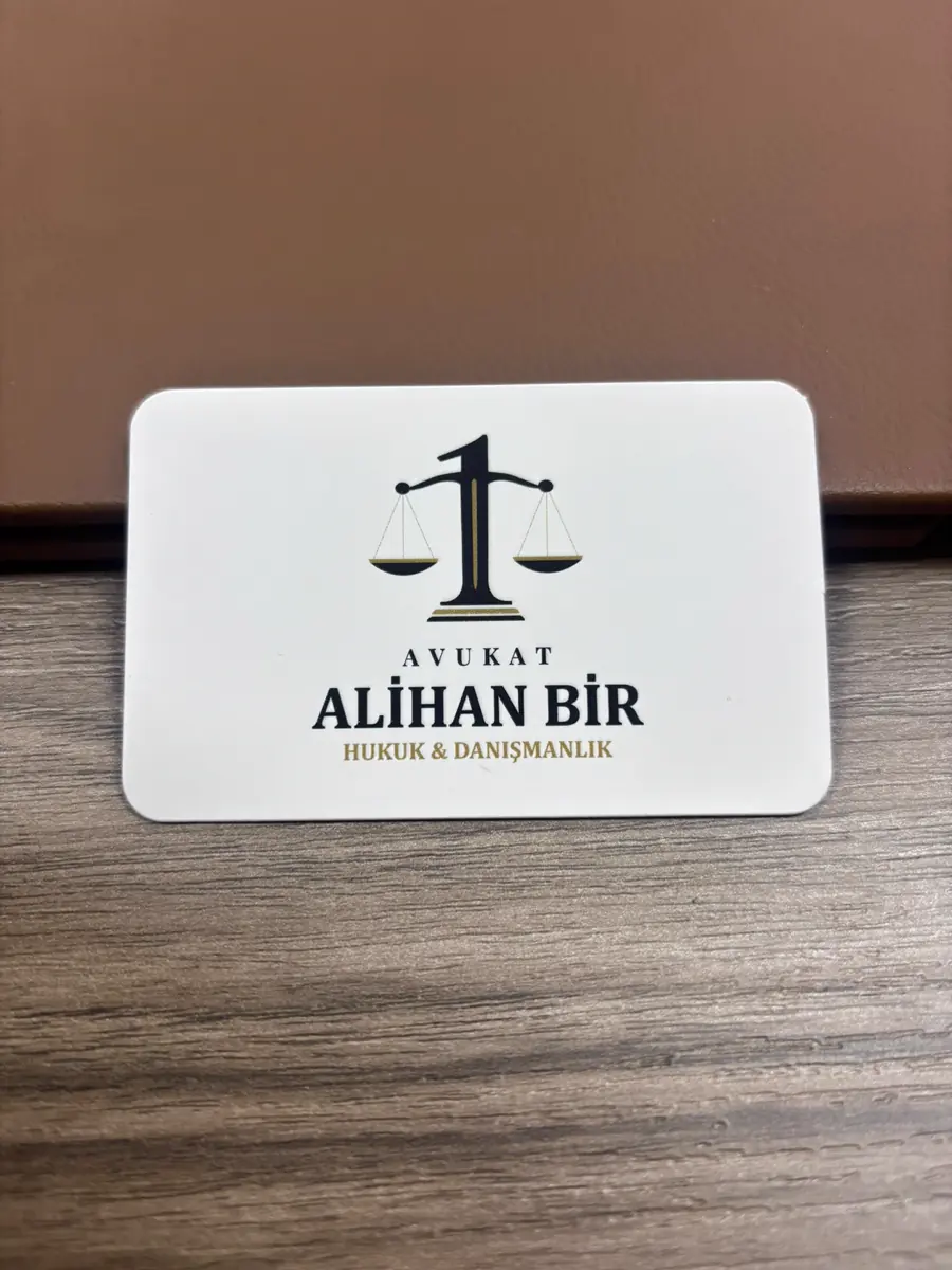
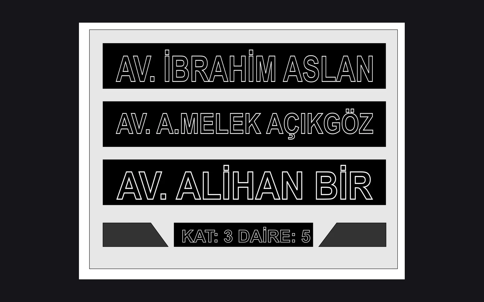
A brand mark, a business card design and its printing were produced for a lawyer working in Kemalpasa. The same name appears on the shared wayfinding sign at the office door, so the job ran from the card on the desk to the sign on the door in one place.
The idea behind the mark
The scales of justice are the shared language of legal brands, and on their own they separate no practice from another. Here the column of the scales also reads as a numeral one, carrying a detail that comes from the brand name itself. From a distance you see the scales, up close you notice the numeral.
Two faces
The card opens on a light cream ground and turns over to navy. The two faces are negatives of each other, which makes turning the card a function rather than a habit. The front states identity, the back carries the way to reach the office. The gold rule holds the same weight on both faces, so the card shows the same brand whichever side lands face up.
The band at the door
On the wayfinding sign the three names are stacked, and this one sits in the lowest band. The floor and flat number follow immediately below it, so an eye that reads the name reads the address next. The letters were cut as outlines on black rather than solid. Under corridor lighting a solid letter glares and an outline does not.
Logo design and the brand mark
The mark was built without repeating the classic symbols of the profession. It had to separate from the other brands working on the same floor, so the visual language was kept deliberately plain.
How the business card was designed
The two sides of the card do different jobs. The front carries the brand and the back carries the contact details. The side with the contact details holds personal data and is therefore not published in the portfolio.
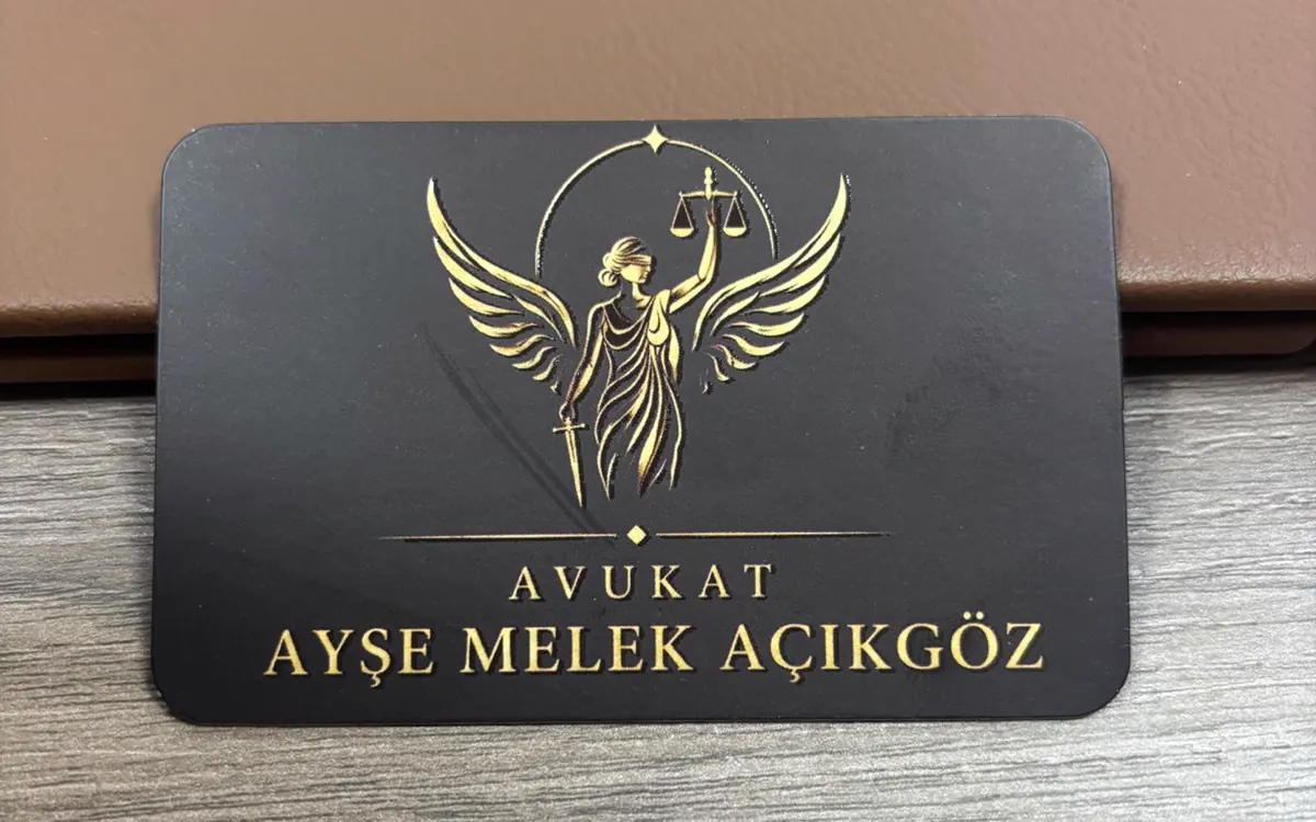
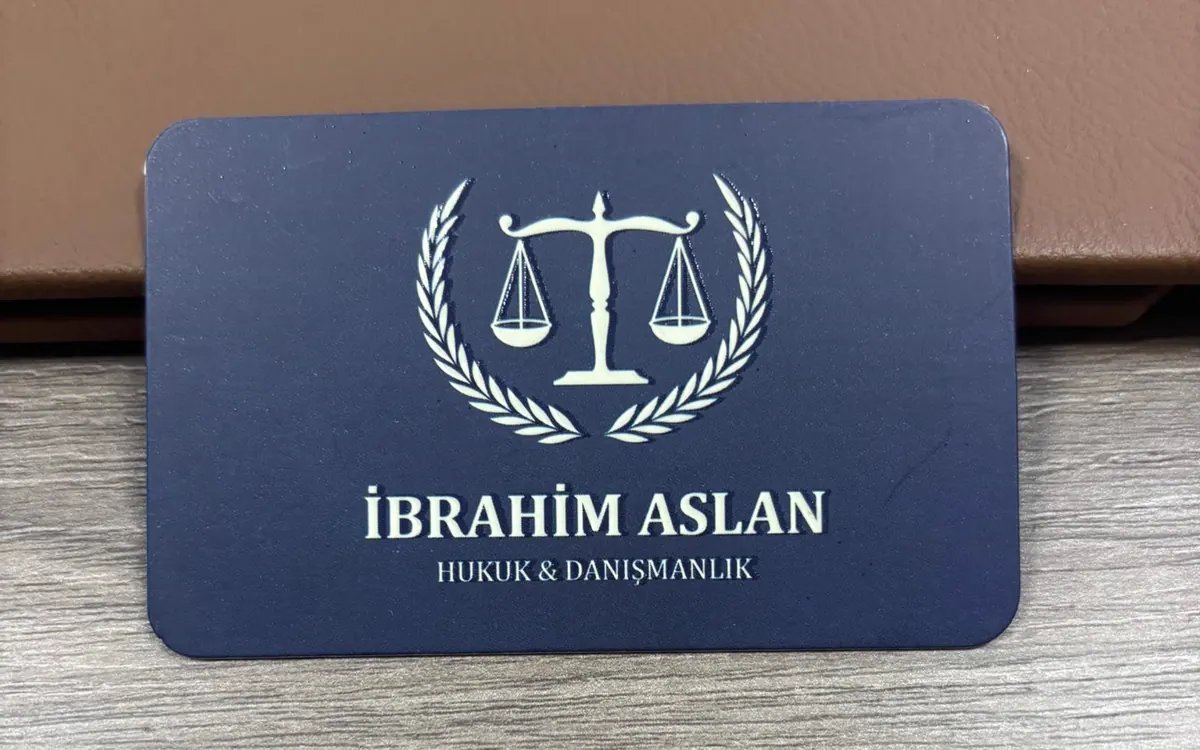
The cards were printed in a run of 1000. The size is 85 × 55 mm, the stock is 700 gsm laminated board with a matte finish. The brand mark was applied with embossing and spot varnish.
The directory sign
The directory sign at the door carries three separate brands together. The three names were set at the same type size, because enlarging or shrinking one band would load the sign with a ranking it is not meant to carry.
Frequently asked questions about this work in Kemalpasa
What should a lawyer business card look like?
Readable, plain and built on a single mark. The job of the card is not to show a design, it is to bring the identity back to mind wherever it was left. That is why type size and paper choice come before decoration.
How is a sign arranged when several offices share one floor?
A shared directory sign is built and every brand gets its own band. The type size and the spacing of the bands are kept equal, so the sign does not put anyone ahead of the others.
Should the logo, the card and the sign come from the same place?
It is not a requirement, but when they come from one place the proportion and the colour of the mark stay the same on all three surfaces. Colour drift is the problem seen most often when the work is produced in separate places.