Summary
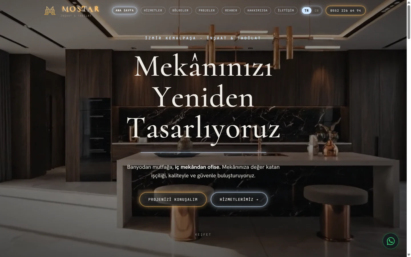
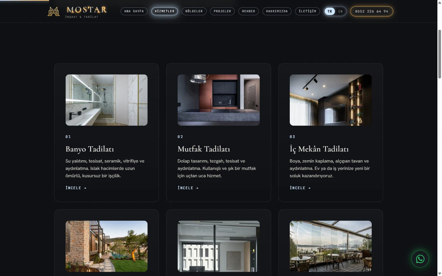
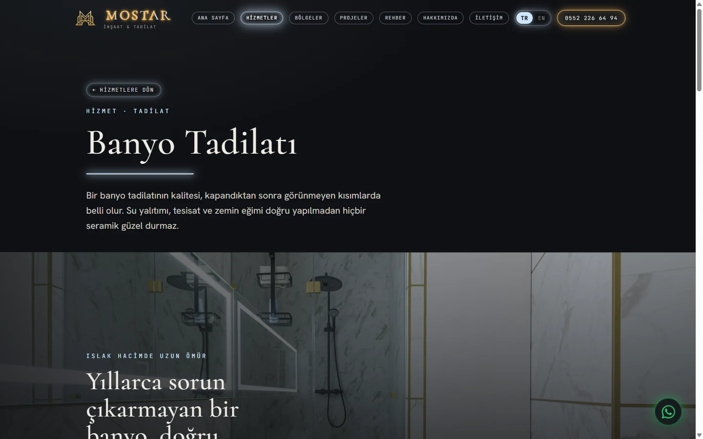
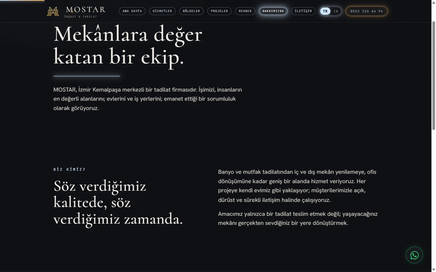
MOSTAR is a renovation brand in Kemalpasa, Izmir, working on interiors and offices from bathrooms to kitchens. İZVELA produced the corporate website, the logo, the business card, the office glass application and the facade signage from one place, and set up the Google Business Profile together with the Apple Maps listing.
Project detail
The need
MOSTAR renovates everything from bathrooms and kitchens to interiors and offices in Kemalpasa, Izmir. They came to us to build the entire visible face of the brand from one hand. The list was clear from the start. A corporate website, a logo, business cards, a treatment for the office glass, facade signage and a business listing that carries the correct details on the maps. They wanted every piece to share one character rather than read as a set of unrelated jobs. Their clients entrust high-budget work and the decision is most often made by the women of the household, so conveying quality and trust within the first second was the central expectation. A template site would not have met it. The project archive was still being put together at the time, so trust had to be carried by design and content rather than photography.
The approach
We treated the work as one identity rather than a set of separate jobs. The logo came first, then we made sure it held up equally well on a business card, on signage, on glass and on screen. We built a bespoke "LED light" design language. An anthracite-dark stage is where light glows best. A luxurious serif typeface (Cormorant), warm-amber and cool-daylight LED accents and a cinematic intro curtain give the site a showroom-grade feel. The same language carried over to the printed pieces and the facade signage, and frosted window film was applied to the office glass. The brand now reads the same on screen and on the street. This identity was deliberately kept well away from İZVELA's own visual language, because MOSTAR's warm, luxurious character is entirely its own.
How we built it
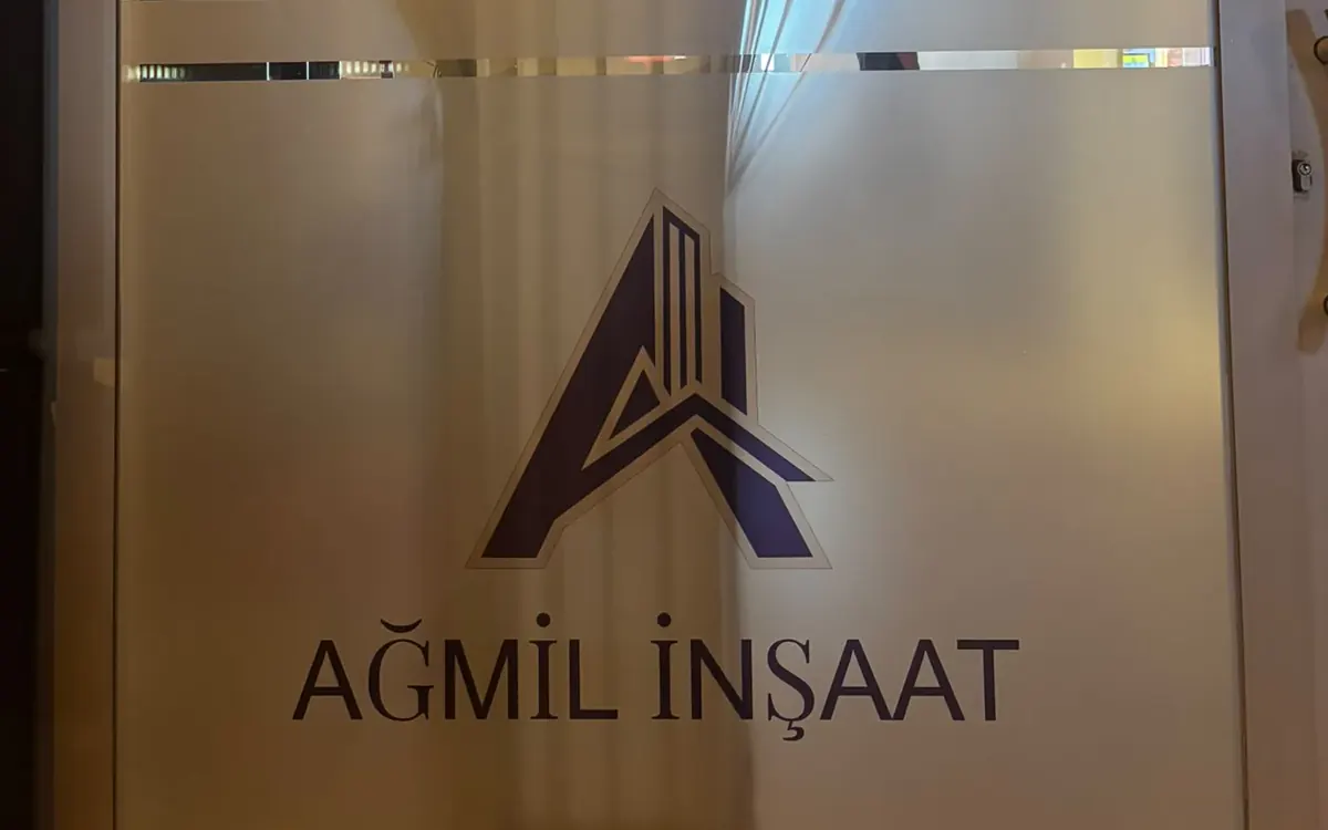
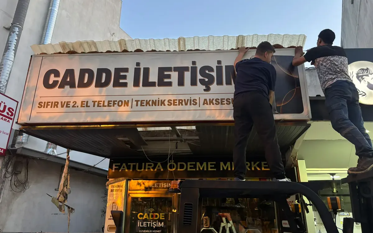
The site was written from scratch, not assembled on a ready-made theme. Fonts and images travel with the site and depend on no outside service. Two complete versions were prepared, Turkish and English, so every page exists in both. Business details were marked up in a form search engines can read, which is why the address and opening hours appear correctly in search. Security was kept at its strictest setting. After launch we opened the Google Business Profile and the Apple Maps listing, with the same name, address and phone written in all three places. The work on site ran to measured figures. A total of 55 square metres of frosted film was applied across the 10 panes on the office facade. The facade sign was installed as a single 7.20 metre by 90 centimetre piece, carrying chrome-faced letters alongside illuminated letters on the same board. Timings on this project ran as follows. Design, printing and application of the frosted film took five days. The composite face and the letters were produced in a week, installation took two days, and the sign work was finished within seven to ten days end to end. The website was delivered in 21 days. The Google Business and Apple Maps listings were opened within two to three days.
The result
What came out is a brand run from one place. The same language from the logo to the signage, from the business card to the map listing. The site is fast, secure, bilingual and showroom-grade, and it scored full marks for accessibility and quality in independent audit tools. It is live on its own domain and its pages are indexed by Google. The gallery will grow as real before-and-after project photos are added.
How the website was built
The site was written from scratch rather than assembled on a ready made theme. Someone searching for renovation work around Kemalpasa decides within seconds on a phone, so loading speed and mobile readability came before anything else in the design.
The content was built in two languages and every page has a counterpart in the other one. The business details are marked up in the page source, which is why the address and the working hours appear correctly in search results.
Google Business Profile and Apple Maps
In local search the map card often appears before the website itself. The profile was opened, the category and the service area were set to cover Kemalpasa and the surrounding area, and the details were entered with exactly the same spelling used on the site.
The Apple Maps listing was created in the same round. Someone searching from an iPhone map needs that second listing to find the business, and it is missing for most companies.
Logo design and the brand language
The logo was drawn first, then checked one by one on the business card, on the glass surface, on the facade sign and on screen to confirm it holds up everywhere. The character of the brand was built on a dark ground with light breaking across it.
The cards were printed in a run of 1000. The size is 85 × 55 mm, the stock is 700 gsm laminated board with a matte finish. The brand mark was applied with embossing and spot varnish.
Frequently asked questions about this work in Kemalpasa
Can a website and signage be ordered from the same place?
Yes. On the MOSTAR project the website, the logo, the business card, the glass application and the facade sign were all handled from one place. Design, production tracking and installation coordination stayed with İZVELA, so the business dealt with a single contact.
How long does a new website take to appear on Google?
The site is submitted to Search Console on the day it goes live and the sitemap is sent. Indexing usually takes somewhere between a few days and two weeks. Settling into rankings takes longer, and the Google Business Profile together with reviews affects that directly.
Which pages does a renovation company need?
Separate pages for each service, a project section where real work is visible, and contact. MOSTAR was built that way. Because every service has its own page, different searches land on different pages.