

The work
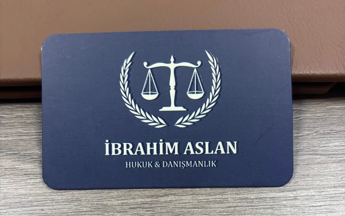
A brand mark and a business card were prepared for a lawyer working in Kemalpasa. The same brand also appears on the shared wayfinding sign at the office door.
PROJECT · Law Practice
Business card design for a law practice in Kemalpasa. A winged figure of justice drawn in burgundy and gold, with the same name on the shared door sign.
·
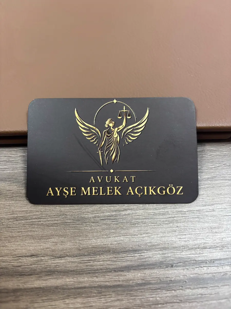

Av. A. Melek Açıkgöz is a lawyer working in Kemalpasa, Izmir. İZVELA produced the logo built around a winged justice figure, the business card and the band on the shared directory sign at the office door.
A brand mark and a business card were prepared for a lawyer working in Kemalpasa. The same brand also appears on the shared wayfinding sign at the office door.
This mark is not an abstract symbol but a winged figure of justice. The scales sit in the figure’s hand, so the symbol stands inside a scene rather than alone. The wings open to either side and fill the upper half of the card. That choice separates the brand from its neighbours, because the two other practices on the same floor carry geometric marks with no figure.
Burgundy and gold were chosen. Burgundy is dark without being black, so it reads serious without turning cold. The gold was used as a line rather than a fill. A thin line keeps the detail of the figure alive at card size. A gold fill would have turned the figure into a patch and the separation of the wings would have been lost.
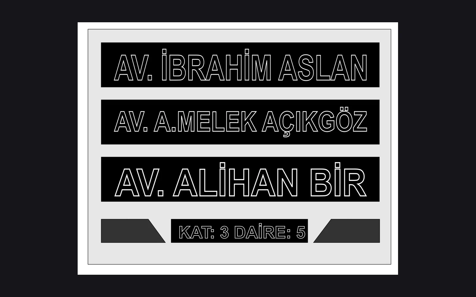
On the wayfinding sign this name sits in the middle band. All three names were set at the same size. Making the middle band larger or smaller would have loaded the sign with a ranking, and all three are equal tenants of the floor. Equal sizing is therefore not a styling preference but correct information.
The mark of the brand is not an abstract symbol, it is a winged justice figure. The scales sit in the hand of the figure, so the symbol is not standing alone but inside a scene. The wings open to both sides of the figure and fill the upper half of the card.
That choice separates the brand from the neighbouring offices, because the marks of the two other brands on the same floor are geometric and carry no figure.
Burgundy and gold were chosen. Burgundy is dark without being black, so it stays serious without turning cold. The gold was used as a fine line rather than a fill, because a fine line keeps the detail of the figure alive at the small size of a card.
The cards were printed in a run of 1000. The size is 85 × 55 mm, the stock is 700 gsm laminated board with a matte finish. The embossing and the spot varnish were applied to both sides of the card.
On the directory sign this name sits on the middle band. The three names were set at the same type size. Shrinking or enlarging the middle band would have loaded the sign with a ranking.
Making them together is what lets the mark sit on the card at the right proportion. When a logo is drawn elsewhere and placed onto a card afterwards, the problem seen most often is the mark falling apart at small sizes.
Not as long as it is drawn with a fine line and tested at a small size. On this project the gold was used as a fine line instead of a fill, because a gold fill turned the figure into a smudge.
On its own band and at the same type size as the other brands. The spacing between the bands is kept equal as well, so the sign shows the three offices at the same level.