

DIGITAL · KEMALPASA / IZMIR
Logo Design
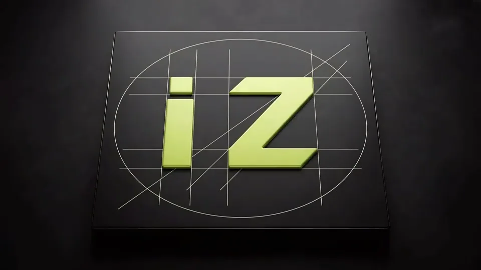
The one mark that captures a business's character. Working with equal strength on a sign, a business card, and a screen.
·
A logo is the smallest yet most-seen part of a business. It grows to meters on a sign, shrinks to centimeters on a card, and drops to a few pixels on a phone screen. A good logo stays recognizable at all three scales. At İZVELA a logo is designed not as a single pretty image, but as a system that works across all of these surfaces.
Instead of marks churned out by templates or "logo maker" sites, we build an identity from scratch by listening to the business's industry, story, and competitors. What you receive is a brand package (colors, typography, and usage rules) ready for both digital and print.
What’s included in Logo Design
- +Custom logo designed from scratch for your industry and brand (no ready-made templates)
- +Horizontal, vertical, and icon (favicon/social) variations
- +A brand color palette and typography selection
- +Ready files for signage, cards, glass, and digital (vector + raster)
- +A short usage guide (where and how to use it, minimum size)
How Logo Design works
Discovery
We listen to your business, industry, and taste, and scan competitor marks.
Sketches
We draft a few directions and choose the strongest idea together.
Design & revision
We refine the chosen direction into its final form through revisions.
Delivery
We hand over every variation and file with a short usage guide.
Logo Design questions we are asked
How long does logo design take?
It depends on the number of variations and revision rounds. The process starts with a discovery call and speeds up once you approve a direction. A firm timeline is given at the quote stage, once scope is clear.
Can I use the logo on signage too?
Yes, we design the logo as vector art from the start so it holds up on large surfaces like signs, vehicles, and glass. Because signage is our own side of the house, the team that designs your logo and the team that produces your sign are the same. No color or proportion drift.
Do I keep all the files afterward?
Yes, delivery includes all working and usage files for your logo, so you are never dependent on us to use it elsewhere.
Is there a difference between an emblem and a logo?
There is, though everyday speech blurs it. An emblem is the shape or symbol standing for the brand, recognisable on its own. A logo is the whole formed by that shape together with the written name of the brand. Some brands run on the emblem alone, others on the wordmark alone. We build both together on every job, because signage, business cards and social media each want a different arrangement. Even if you ask only for an emblem, you receive the symbol and the written version together.
What does logo design cost and how long does it take?
The timescale follows the scope of the work. A single logo and a full identity covering logo, business cards and signage application are not the same job, and pricing follows that scope. How many directions are presented, how many rounds of revision are included, and whether the files for signage are prepared as well all affect the figure directly. Current numbers are written openly on the packages page.
What types of logo are there, and which suits us?
There are four main forms and the choice depends on the nature of the business. A wordmark is the name itself, custom drawn, and works well where the name is short and memorable. A monogram is built from initials and rescues businesses with long names on small surfaces. A symbol is an abstract or literal shape, and since recognition on its own takes years, new brands generally use it alongside the name. An emblem interlocks shape and text, giving a classic and established impression, though it loses detail when reduced. For most businesses the right answer is a wordmark delivered together with a small symbol.
How does the design process run?
We do not start on screen. First we talk about the business, who it sells to and how the competitors look. Then a large number of sketches come out on paper, and most of them exist to be eliminated. Eliminating is the real work of design. The few directions left move into digital, where proportion and spacing are tuned. What reaches you is the result of that filtering, so we discuss three directions rather than a hundred sketches. Once a choice is made the refinement stage begins, and that is often the longest part.
Do you look at competitor logos?
We do, and not to resemble them but to separate from them. It is common for everyone in a sector to reach for the same symbol. A roof in estate agency, a lorry in haulage, a cross in healthcare. Those conventions tell a customer quickly what you do, but they do not distinguish you from the business next door. A competitor sweep shows us which ground is crowded and which is empty. Sometimes the right decision is to stay inside the convention with a different reading of it, sometimes to step outside it entirely. Either way it is a deliberate choice rather than an accident.
Should we go for a fashionable logo or a lasting one?
A logo's life is measured in years, a trend's in months. A business that takes on today's fashionable effect finds itself renewing its signage, its cards and its vehicle three years later. So we recommend a plain, structural mark. Plain does not mean bland, it means taking out what is not needed. Character is carried by colour, typography and the use of space. When those three change the brand reads as refreshed while the mark stays put, which means accumulated recognition is not thrown away.
Our brand name is long. Will that cause a problem?
It can, and it is worth discussing at the start. A long name runs horizontally, so it does not fit narrow shopfronts, and in the square frame of social media it shrinks past readability. The usual answer is a two-layer delivery. The full name for horizontal use, an abbreviation or monogram for small spaces. With some businesses we also suggest simplifying the name. Writing the full legal title into the logo is not compulsory, the title can stay on the invoice while the logo carries only the brand name.
How many options will we see, is revision unlimited?
We do not promise unlimited revision, and the reason is honesty. Processes described as unlimited either run out early in practice or keep the work open indefinitely and wear out both sides. Instead we give a clear scope, and how many directions are presented and how many rounds of correction are included is written on the packages page. Our experience is this. With a good brief, three directions are usually enough. Seeing a large number of options does not make the decision easier, it makes it harder.
Website projects start from $250, and the monthly digital plans are listed separately. Full scope and pricing is written openly on the plans page.
Let's draw your brand's first mark together. A hello is enough.