


ADVERTISING & SIGNAGE · KEMALPASA / IZMIR
Channel Letter Signage
Read by its raised volume in daylight and by internal light at night. The most prestigious storefront sign there is.
·
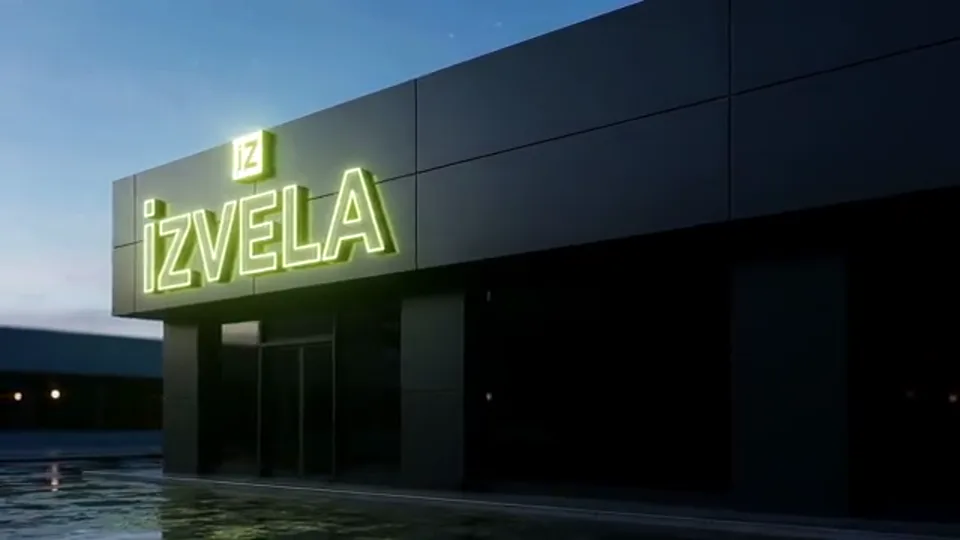
Channel letter signage (illuminated dimensional letters) is a type where each letter is produced individually, mounted to the facade, and lit from within by LED. Unlike a flat printed panel, it reads by shadow and depth in daylight and by light from inside the letters at night, which is why it's the most prestigious, most-preferred facade solution for brands.
Here, channel-letter production runs from the same hand as your logo design. Letter proportions, height, and color are planned to the facade and reading distance. The acrylic face, aluminum/galvanized body, and low-consumption LED directly affect the sign's lifespan, so material quality is never compromised.
What’s included in Channel Letter Signage
- +Letter sizing planned to the facade and reading distance
- +Dimensional letters with acrylic faces and aluminum/galvanized bodies
- +Low-consumption, evenly distributed LED lighting
- +On-site survey, measurement, and installation
- +Electrical connection and a working handover
How Channel Letter Signage works
Survey & measure
We inspect the facade on-site, take measurements, and plan letter size to reading distance.
Design approval
We present a mounted-preview visual (before installation) for your approval.
Production
The letters go into production. Production tracking, including the LED and electrical infrastructure, stays with us.
Installation
We mount to the facade, connect power, and hand over in working order.
Channel Letter Signage questions we are asked
What's the difference between channel letters and a flat illuminated sign?
A flat illuminated sign places a print inside a single box. With channel letters each letter is its own volume, lit individually. Channel letters are deeper, more prestigious, and read more clearly at night, which is why brands prefer them on facades.
How long do channel letters last?
The acrylic, body, and LED quality determine lifespan. Quality LEDs are long-lived. Warranty and maintenance terms are settled in person during our meeting.
Do I need municipal permission?
Facade signs are subject to municipal signage/advertising permits in most districts. Applying for and following up the permit is the business owner's responsibility. We run the production and installation of the approved sign.
Channel letters are over our budget. Are there other options?
Two common alternatives. An acrylic sign is applied over a single surface and gives a clean result on small to mid-size facades. A tensioned vinyl sign covers a wide surface in one piece and noticeably lowers the cost per square metre on large facades. We produce both. Which one fits depends on facade size and whether you want night illumination, and that is settled during the survey.
Are illuminated letters and raised letters the same thing?
They belong to the same family but differ. A raised letter stands proud of the surface and reads by its daytime shadow, and it may have no lighting inside. An illuminated letter has LEDs inside it and reads by its own light after dark. Cafes and restaurants, busy in the evening, choose the illuminated version, because their customers pass in the evening.
Is shop signage the same on a high street and inside a mall?
No, they are two different jobs. On a high street the sign has to read from a distance and at driving speed, so letter height and light output come first. A shop sign inside a mall is read from a few metres, and most mall managements impose their own specification for materials, sizes and lighting. In both cases we see the location and take measurements first, and for mall work we ask for the specification before production and build the design around it.
How is letter height decided?
It is calculated from reading distance rather than judged by eye. Roughly this relationship holds. Every centimetre of letter height gives about three metres of reading distance. In practice three bands emerge. On shop and store frontages we work between 30 and 60 centimetres, and on most facades the most readable result comes between 35 and 45. Indoors and inside malls the reading distance is short, so 15 to 30 centimetres is enough. On roof and tall building facades we start at 80 centimetres and go past 150. The second factor is the facade itself. Letters have to breathe within the width of the frontage rather than run edge to edge. During the survey we measure the distance and show how different heights would sit on a photograph of the facade.
Should light come through the face or from behind the letter?
Both methods exist and their characters differ. Front lighting makes the face of the letter glow and the text reads directly at night. It is the most common and the most readable method. With reverse lighting the light strikes the wall from behind the letter, the letter reads as a silhouette and a halo forms around it. That gives a calmer, more prestigious look but reads less well, so it is not recommended on facades that have to be read from a distance. Reverse lighting works nicely at the entrances of offices, clinics and jewellers.
Does the facade surface affect the installation?
Directly, and it is one of the first things we look at during the survey. On concrete and brick the letters can be fixed straight into the surface. On composite and curtain-wall facades there is a cavity behind, which calls for a supporting profile. Buildings with external insulation need care, because the insulation layer carries no load and the fixing has to reach the structure behind it. On glazed facades drilling is not possible and a different solution is built. None of this can be known without measuring on site, which is why we do not price from a photograph.
How is letter depth chosen?
Depth decides both the look and the lighting. In a shallow body the LED sits very close to the face and the individual points can show through. With enough depth the light spreads and the face glows evenly, which is why larger letters get deeper bodies. On the visual side, depth casts a daytime shadow, separating the letter from the facade and giving it more presence. A very deep body projects too far from the facade and on some buildings that causes trouble aesthetically as well as in terms of permission.
How is the electrical connection planned?
The supply to the sign has to be run to the facade in advance, because pulling cable after installation means opening the wall again. In a new shop we raise this at the fit-out stage so the electrician leaves the line at the right point. Power supplies usually sit inside the sign body or just behind it, and they have to stay reachable for service. A timer or a light sensor can be added so the sign switches itself on and off and nobody has to remember it in the evening.
Why does the spacing between letters matter?
Because readability is decided as much by the space between letters as by the letters themselves. Text that looks right on screen can appear cramped once the letters are made individually and hung on a facade. The reason is scale. Spacing that goes unnoticed at small size pushes the letters together at one metre tall. So we check the design at production size and reset the spacing where needed. The same applies to logos, since a logo drawn for screen has to be considered separately on a facade.
Pricing here depends on dimensions, material and installation conditions, so we do not quote a single starting figure. The site survey is free. Web and digital plan pricing is written openly on the plans page.
Let's plan a survey and measurement for a channel-letter sign worthy of your facade.