


The work
A brand mark and a business card were produced for a lawyer working in Kemalpasa. On the shared wayfinding sign at the door this name sits at the top, so it is the first line read by anyone stepping out of the lift.
PROJECT · Law Practice
A business card and the door wayfinding sign for a law practice in Kemalpasa. The scales are framed in laurel, and the name holds the top band of the sign.
·
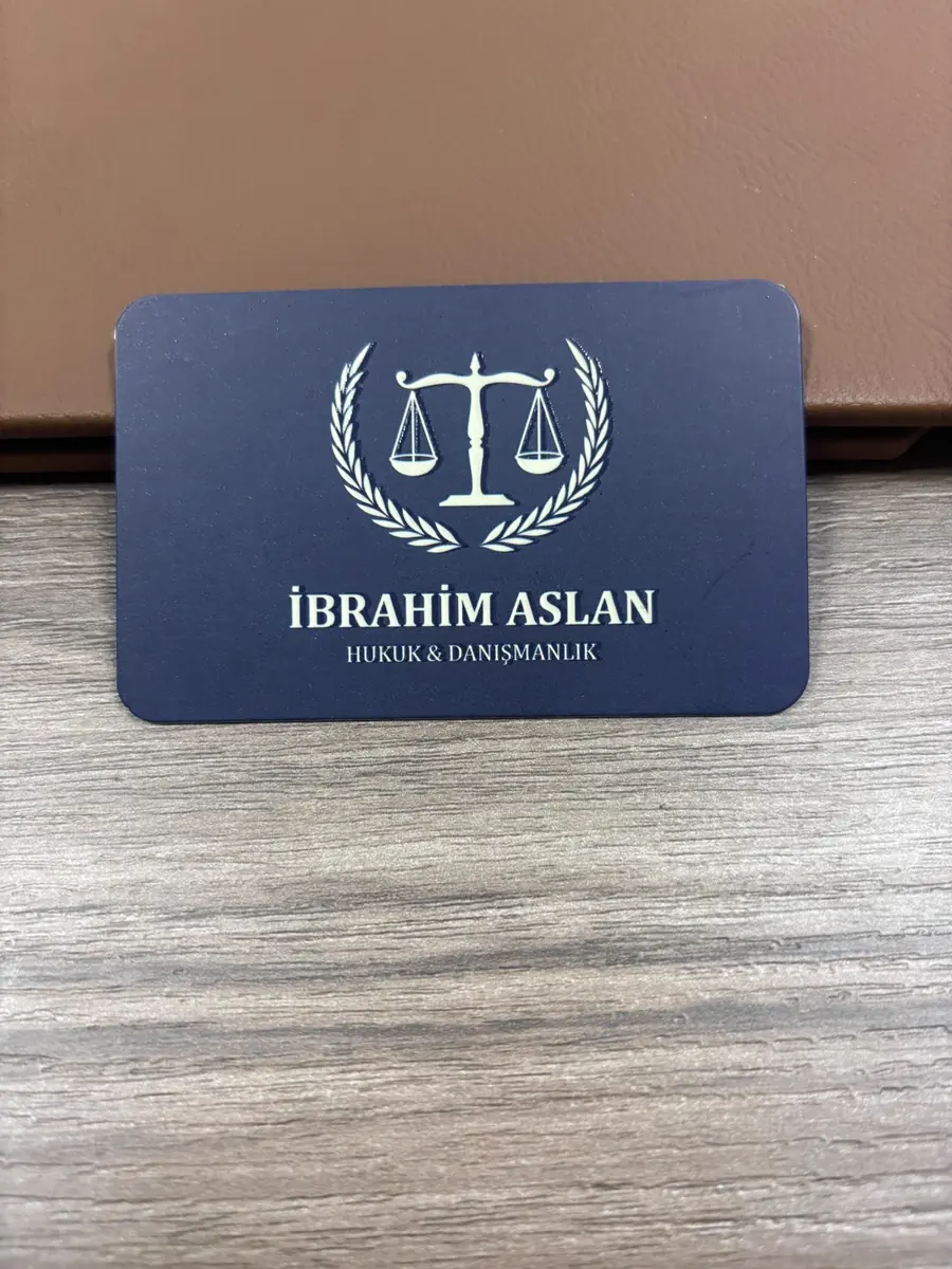

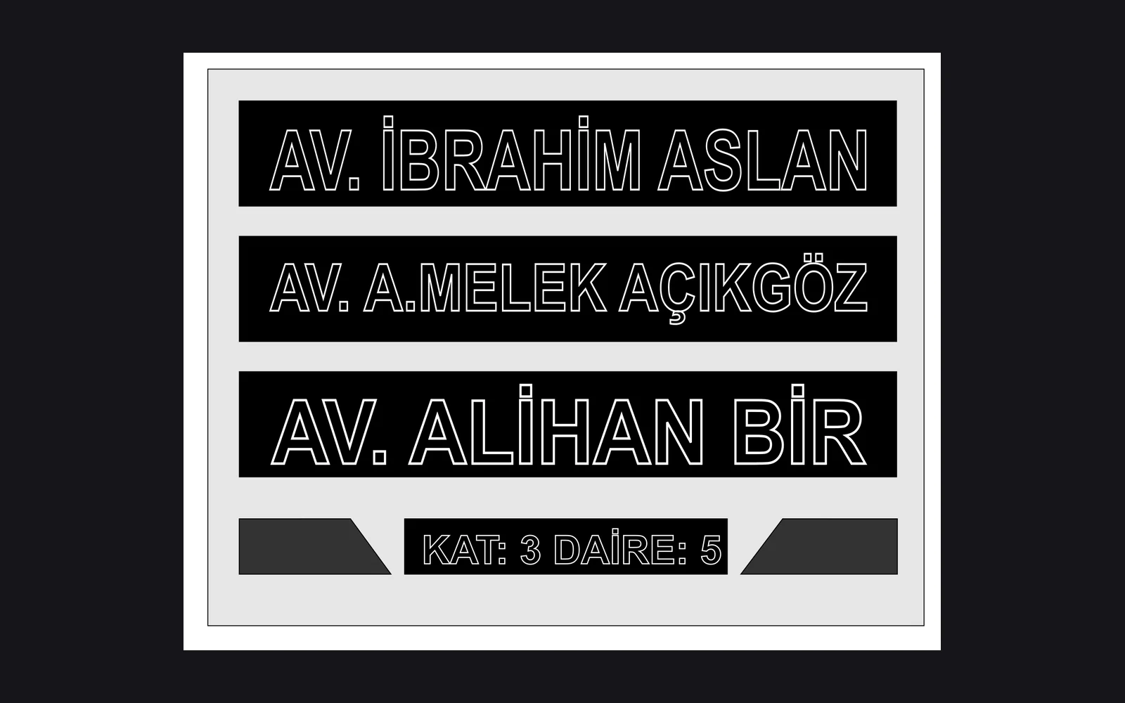
Av. İbrahim Aslan is a lawyer working in Kemalpasa, Izmir. İZVELA produced the logo, the business card and the band on the shared directory sign at the office door.
A brand mark and a business card were produced for a lawyer working in Kemalpasa. On the shared wayfinding sign at the door this name sits at the top, so it is the first line read by anyone stepping out of the lift.
The mark frames the scales in laurel. Laurel is a long standing element in legal imagery, and in most uses it is drawn thick and heavy. Here the branches were kept thin and stop short of touching the scales. That gap keeps the mark legible at small sizes, so nothing collapses into a solid patch at card scale.
The card opens on navy with the mark and type in cream. Turned over, the ground becomes cream and the same mark prints in navy. One colour pair works in both directions, so the brand needs no separate drawing for dark and light grounds. That makes it straightforward to carry the same mark onto a sign or a glass surface later.
The wayfinding sign is 45x35 cm and sits in four bands, and this name holds the top one. Because the top band is the most read position, letter height was measured against the whole sign rather than against its own band. All three names stayed at the same height and the top band did not pull ahead.
The mark was drawn in a classic language with a plain construction. Heavily stylised marks look weak on an official document and on a sign, so the form was kept restrained.
Navy and cream were chosen. Navy gives a corporate ground, cream stays readable on top of it, and two colours repeat easily in print.
The cards were printed in a run of 1000. The size is 85 × 55 mm, the stock is 700 gsm laminated board with a matte finish. The brand mark was applied with embossing and spot varnish.
This name sits on the first band of the shared sign. Because the bands of the three brands are set at the same size and the same spacing, the sign reads as a list.
A mark is chosen that works the same way on a document, on a card and on a sign. Marks decided without being tested on those three surfaces usually fall apart at small sizes.
No, two colour work gives a more stable result in print. As the number of colours grows, the risk of a tone shift between separate print runs grows with it.
Yes. Because the bands are produced separately, changing one band does not affect the rest of the sign.